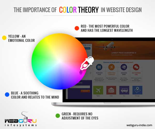
In web design, colour significantly impacts beyond visual appeal, affecting how visitors view and engage with a website. It is a nonverbal communicator that can influence decisions, evoke strong feelings, and transmit mood. Colour has a crucial role in situations where consumers frequently make snap decisions.
We’ll talk about the complex relationship between colour and online design, including its psychological foundations, branding implications, accessibility requirements, modern trends, and workable methods for choosing colours that work. Designers can create experiences that attract and interest users, reinforce brand identity, and enhance usability by grasping the subtle interactions between colours. We hope to give readers a thorough understanding of how colour may be used to make Melbourne web designs more significant and dramatic.
Understanding Colour Psychology
Colour psychology, the study of how hues can affect perception and behaviour, lies at the core of colour’s influence on web design. Different colours can elicit specific emotions and reactions. For instance, blue might induce tranquillity and trust, whereas red may elicit excitement or urgency. Web designers must consider this psychological effect because it impacts user engagement and conversion rates. Designers can establish a desired mood for a Melbourne web design that fits the audience’s expectations and the site’s purpose by carefully choosing a colour scheme.
Emotional Response to Colours
Varied cultures and people have varied emotional reactions to colour, which are both innate and conditioned. For example, green is a common choice for health and environmental websites since it is frequently connected with nature and growth, inspiring thoughts of serenity and rebirth. By being aware of these emotional connotations, designers can use colour to match a website’s aesthetic with its intended message and user experience objectives.
Colour Harmony
Colour harmony must be achieved to create visually appealing and consistent Melbourne web designs. A beautiful arrangement of colours is referred to as harmony, and it can be produced using a variety of schemes, including triadic, complimentary, and analogous ones. In contrast, contrast refers to applying opposed colours to highlight specific areas. High-contrast colour schemes work especially well for call-to-action buttons or to make writing readable.
Cultural Colour Context
Because colours have diverse cultural connotations, cultural context is important when designing a website. For instance, white is typically connected to sorrow in many Eastern cultures despite being traditionally associated with purity and weddings in Western societies. To prevent misunderstandings and guarantee that the website communicates well across cultural barriers, web designers who aim to reach a worldwide audience must traverse these cultural nuances.
Psychological Principles
Using colour psychology in Melbourne web design entails more than just picking eye-catching hues; it also entails carefully considering how colour selections relate to the website’s objectives and its users’ requirements. For example, utilising cooler hues like blue and green can boost a sense of professionalism and trustworthiness, while warmer colours like orange and yellow can create a warm and welcoming atmosphere that encourages user involvement.
Colour choices include psychological concepts to improve a website’s usability, functionality, and visual appeal. Designers may improve user engagement, make navigation easier, and boost the website’s success overall by making well-informed decisions based on their grasp of the psychological effects of colour.
Role of Colour in Branding
Colour is a crucial component of branding strategy since it may significantly affect how consumers perceive a company. Selecting the appropriate colour scheme can help a business stand out, improve brand identification, and communicate its values. For example, Tiffany & Co.’s classic Robin’s egg blue box is as recognisable as the high-end products it holds, conveying the brand’s value, beauty, and originality right away.
A brand’s colour palette must appeal to its intended audience, arouse the appropriate feelings, and capture the company’s essence. Colour selections must be thoughtful and in line with the perception that a business wants to convey, regardless of the emotion that red elicits or the trust that blue inspires.
Accessibility and Colour Contrast
Making websites useful for as many people as possible—including those with disabilities like vision impairments—is ensured by using accessibility in Melbourne web design. This is where colour contrast comes in, as it affects how easy it is to read and navigate web material. The significance of colour contrast in web accessibility, recommendations for designing accessible colour schemes, and the effects on users with colour vision impairments are all covered in this section.
Use Expectations Impact
Colour trends have a big impact on what users expect. When surfing through modern websites, users want designs that are in line with current aesthetics and styles. By incorporating these trends, a website can feel more engaging, contemporary, and in line with the user’s visual language. But rather than merely following trends for their own sake, it’s critical to use them wisely, ensuring they complement the brand’s identity and purpose.
Conclusion
Colour is a potent instrument for communication as well as an aesthetic choice. Using colour psychology, cultural considerations, and accessibility as a top priority, web designers may create visually stunning and functional websites that cater to a wide range of user needs. Color is still crucial in the ever-changing field of Melbourne web design for drawing viewers in, encouraging interaction, and creating a satisfying user experience.


